


 Typeface
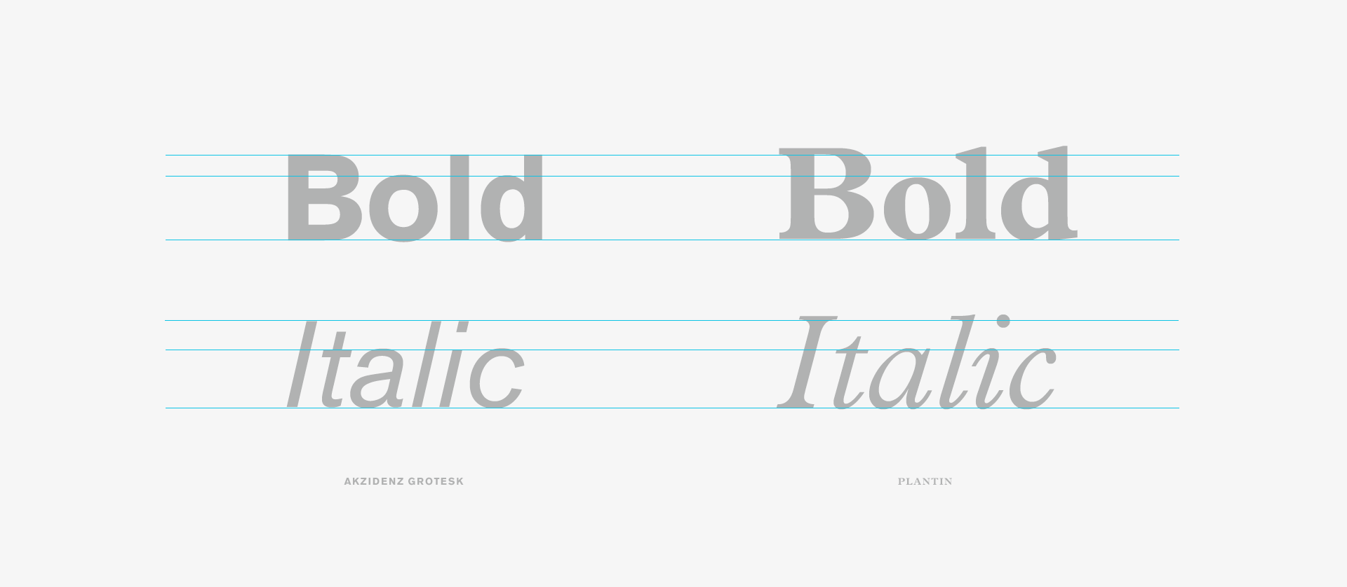
The typefaces are going to do a lot to communicate the character and tone of our experience. Like choosing a car it’s wise to be practical so consider legibility and flexibility but it’s also a bit of a personal decision so pick something with a personality that communicates your product’s values.
Make sure the font is legibility and flexibility. Sufficient weights, italics, international characters all need consideration. Finally, does it pair well with other fonts. Is there a brand font in place this needs to work nicely with? Or are you stuck with a poorly drawn font and style guide? Remember, there are no bad fonts only bad typographers.

Legibility
Not only does your typography need to be readable in small sizes but the colours you choose should contrast with the backgrounds of your experience. Do you need a heavier weight at smaller sizes? There are a few tools online that will check your PSDs and HTML for contrast. Photoshop also has two colour blindness filters protanopia (red) and deuteranopia (green).

Readability
Line lengths should be 8-12 words and leading should be approximately 1.5 x your type size. When determining units of measurement, it helps to start in PS or Sketch with pixels but we use REMs to determine relative values for different screens. This helps with our systematic approach to designing and developing our digital experiences that work in all sizes.

Modular Scaling & Device Sizes
At Valtech we’ve been implementing a fluid front-end framework that scales nicely based on device size. It’s a sophisticated algorithm that is not just 1:1 to device size, there’s some magic math in the formula that controls the rate of scale, keeping things from getting too small. Traditional responsive frameworks set the values at different breakpoints, with a fluid framework the calculations are built into the system. Remember the 8-12 words per line rule? We can maintain that across all devices. Brilliant!
In keeping with the rules of good typography, you should implement some sort of mathematical scale ratio to determine type sizes whether it’s the Golden Ratio, Minor Third or Perfect Fourth.
Style Guide
Record your work in a digital style guide. When creating systems, look to define at least 3 but up to 6 H tags. For more complex sites you might want to define subheads, body, CTA styles as well. Beyond type sizes, leading and line length make sure you’re accounting for colour and tracking. The more detailed the better here. Spending the time to over-communicate here will pay dividends in the end. These practices are best implemented at the beginning of a project.
Design QA
You’re always going to need to build in time for design QA. Ideally you’ll have thought of every scenario but inevitably you’ll need to sit closely, designer and developer, and make adjustments. Designate time to test how your systems work in different viewports. Is it legible, readable and beautiful?
In Summary
When building a system of reusable components make sure you’re doing things right from the beginning. Creating this system at the outset will save countless hours in the long run. Remember, type needs to be legible, flexible, communicate brand values. Use modular scaling and vertical rhythm, build a coherent style guide and make sure to test your results.