Optimising input form fields

May 23, 2019

Optimising input form fields

Keep up the good form in user experience


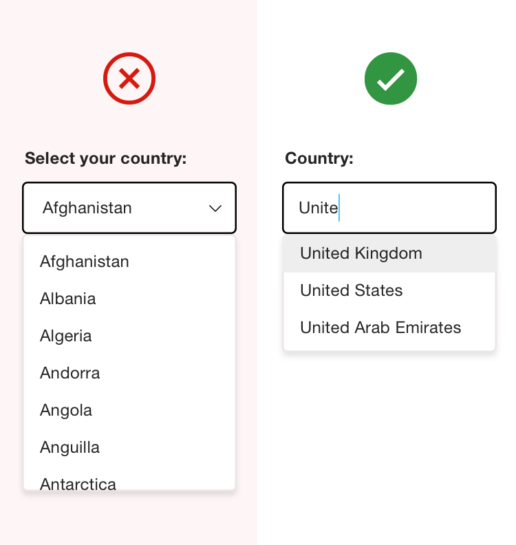
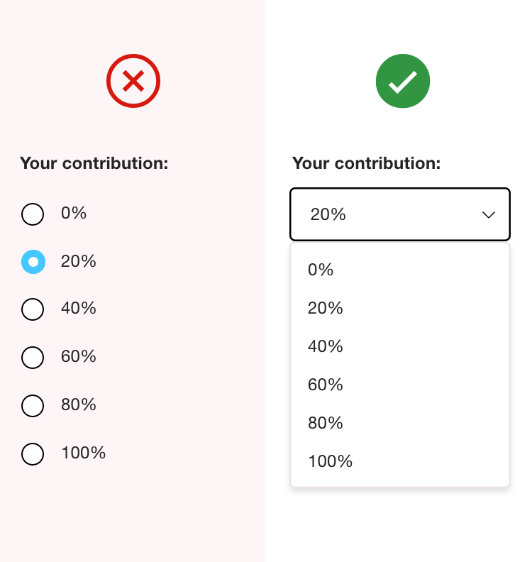
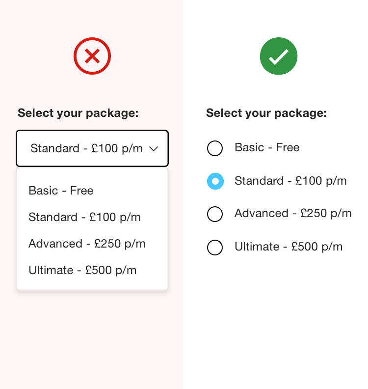
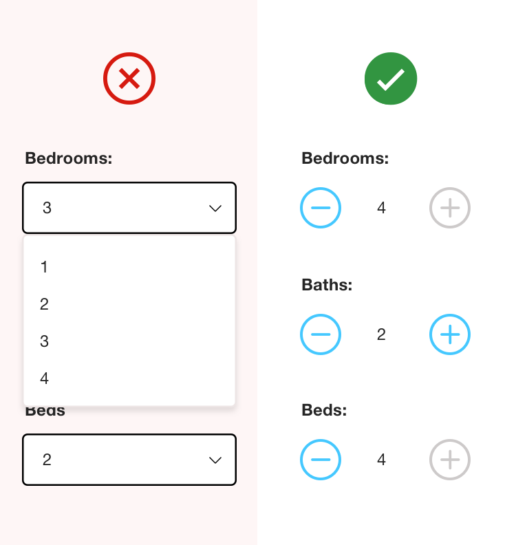
Many registrations and information captures tend to ‘overwhelm’, and initially put the user off, due to the lack of architecture and repeated input formats.

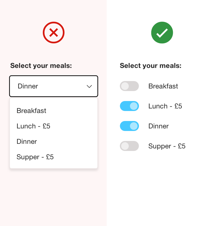
To make a form feel less tedious, it should be phased and broken up into logical sections that are in the context of the user. Progress bars, mandatory signals and success feedback (validation) should be explored to aid their journey and provide guidance on how to enter the required information.

Error tolerance is very important - expect the user to make mistakes! Structuring the experience to accommodate it will reduce frustration and abandonment.

“We must aim to understand our users and their mental model of the problem space we are working within.” - Abby Covert

Careful automation techniques that align with the mental model of the user will initiate progress throughout. A good example is reducing the number of user tasks by automating the relevant native keyboard for every input, such as pushing a number keyboard for date entry and phone numbers. These granular details in automation can make a big difference overall.

The 5 key principles of form design
  1. Illustrate the time required and progress
  2. Always ask as little as possible
  3. Automate/pre fill as much as you can
  4. Use a single column design
  5. Be clear with validation and error messages

Selection components


There are various UI selection components available to aid the user in selecting a required option. The choice can either help or hinder the experience, therefore the decision should be made depending on what the content means to the user.

The use of dropdown selection components should be limited as they hide the options from the user, research shows that some users find them very difficult to use.

Accessibility is a key consideration, ensure that all copy and link labels speak in a descriptive language navigating the requirement of the task, this will provide a clear narrative for screen readers.

The following examples follow good UX practise for form selection tasks as they display all the options to the user without the need to click or tap to reveal the options.

1. Auto complete

When capturing geographic information, it is frustrating for the user if they have to scroll through a drop down of 195 countries in alphabetical order, a three character auto complete is good solution as the information (country) is already known.

2. Dropdown

Dropdowns are useful when limited options have a similar metric format and follow same context, for example percentages.

3. Radio Buttons

Radio buttons should be used when you require one selection from upto 5 options, allowing the user to compare at a glance.

4. Quantity

“+” and “-” buttons must be used to select and change small values, allowing the user to compare and update multiple fields at once.

5. Toggle

Toggle sliders can be used for a selection when you expect that the user will want to choose more than one option.

Focussing on these granular details will not only speed up content entry process, but also help to grow user engagement and satisfaction throughout the registration and information capture journey.

If you have any questions, you can reach out to me on twitter @brandsben

Meet the Challenges of Today's Digital Economy

Ready to take that first step and rise to your digital potential? Contact Valtech today.
Talk to us

Contact us

Let's reinvent the future