


março 09, 2016
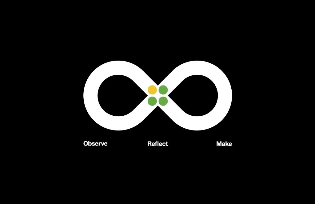
What’s next on the horizon for enterprise UX? Design-thinking at serious scale, the evolution of inclusive design, increasingly natural interactions, a departure from the screen and Material Design are on the minds of the largest makers of enterprise software – IBM, Microsoft and Google.
Marshall McLuhan has been credited with the adage, “We shape our tools; and thereafter our tools shape us.”
As the user experience design field has matured, so has its adoption amongst the behemoth digital workplace software makers. Within the last five years – each has made public moves to refine their design culture.
This week, I thought I’d explore current trends in user experience design, interaction design and design thinking at Microsoft, IBM and Google.
It’s worth watching what they do. As the people who envision and evolve the tools we use every day for work, they’re thinking is bound to be a key influence and inspiration for those shaping the digital experience within their own place of work… as well as a re-shaper of the work itself.
IBM: Design thinking on a massive scale
Two years ago, IBM “tore up the old product development playbook.” As opposed to considering design as window-dressing, a beautification process that occurs after the product has been envisioned, the company made a firm commitment to infuse design thinking holistically into their process.
What makes this significant is the scale at which it is being done. Design thinking is nothing new, but encouraging its adoption in an organization with 400,000 employees is remarkable. As part of the transformation, the company has hired over 1000 designers from top schools including Stanford, Carnegie Mellon, the Rhode Island School of Design and the Parsons School of Design and is continuing the recruitment campaign and the number continues to grow. IBM is aiming for a ratio of one designer to every 15 coders (this is down significantly from 2012 numbers of 1:80.)
The decision to embark on such an intense cultural and procedural overhaul was compelled, according to a recent piece in the New York Times, by the pressures of ever-evolving digital technologies. This is a challenge that’s obviously not unique to IBM alone. They see design thinking as a way to rapidly advance new lines of businesses before the older lucrative (mostly hardware-oriented) businesses fall into decline.
Last month, IBM made their design framework public. At the core of their methods lie three basic principles:
- A focus on user outcomes – user needs are prioritized as the most important factor in driving product decisions. Users are considered the “North Star” of every undertaking.
- Multidisciplinary teams – rapid action requires collaborating as a unit rather than working in sequence. Working as a diverse team also highlights unique insights that would not otherwise emerge by working in more homogeneous teams.
- Restless reinvention – To quote IBM’s words, “everything is a prototype.” No solution is ever considered to be truly complete: the success of the team hinges on their capacity to look at the human need with fresh eyes and putting theories about how to better approach old problems to the test.
Microsoft: Inclusive design and the next wave of human-computer interaction
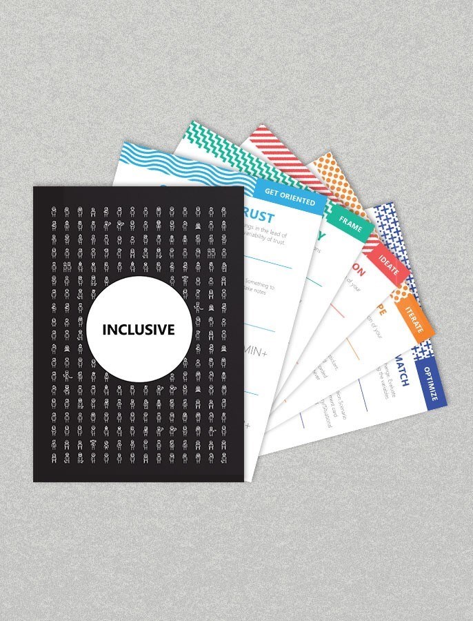
A number of interesting ideas from Microsoft’s design team have emerged of late, but one that resonates with me is their emphasis on inclusive design. Moving beyond accessibility, inclusive design is formed on the basis that “disability” is a condition that arises from context rather than a personal attribute. When it comes to people, there is no “normal”; the design of environment, for example, can impede or assist our efforts. Disability is dynamic – changing as we navigate new situations. As we consider the design of environments, physical and digital, inclusive design encourages the consideration of spectrums of human aptitudes. Designing with edge cases in mind, they argue, can result in improved experiences for many.
Microsoft’s wonderful 21-minute documentary, Inclusive, is chock-full of examples of inclusive design – from the now ubiquitous “curb-cuts” (dips in the sidewalk at intersections, initially conceived to assist the passing of wheelchairs but now enabling the flow of people with baby strollers, skateboards, wheeled suitcases etc); to the mobile device brightness control settings (introduced as a consideration for people with visual impairments but useful to many in a range of lighting conditions.) A smile-worthy innovation featured in the video is Microsoft’s own work with Skype Translator – breaking down language and hearing barriers.
Inclusive with audio description from Microsoft Design on Vimeo.
Canadian Prime Minister, Justin Trudeau, recently said “Diversity is the engine of invention. It generates creativity that enriches the world.” The same could be said about diversity in the modern workplace as driver of innovation. The digital workplace should be architected to encourage the innovations that swell from a diversity of perspectives; inclusive design offers tangible toolsets for priming the designer’s mind for doing so. Microsoft shares their own thoughts and formulas through their inclusive design toolkit:


The other design thread that I find particularly exciting from Microsoft is their current emphasis on conversational interfaces and natural language. It’s hard to argue that the world of digital design has not been largely focused on our relationship with the screen. Even with dalliances in gestural interfaces, the screen remains primary. But as connected devices continue to proliferate, perhaps our reliance on the screen is ebbing.
Microsoft’s UX Design Lead, Joseph Dickerson, named voice interaction one of the top design trends for 2016. One of Microsoft’s most publicized forays into conversational interfaces is arguably the digital assistant, Cortana.
Related: For background on Cortana – visit here.
Cortana’s designer, Kat Holmes, believes that “curiosity and play are central to design” and this philosophy is embedded in Cortana’s personality. Her work is focused less on designing products and more on designing relationships – and considers the “emotional exchange” just as important as the “informational exchange.”
Holmes was recently featured in a long form piece in Fastcodesign. The article conveys how she reached an epiphany in her design process, after studying Spike Jones’ movie, Her.
I particularly loved this quote in relation to her process in grappling with Cortana’s nature: “In trying to understand how computers should interact with humans, the best guide was how humans interacted with humans.” Holmes found such alignment between her own work and the movie Her – she organized a series of workshops to explore the “humanity” of software: “Captivated by Her”. The outcome of which was a pair of very thought-provoking documentaries.
Here’s the lesson I see in this for the Enterprise UX designer; so many enterprise applications struggle with adoption. Perhaps because they strip away the humanity of work. In designing applications for enterprise use, Holmes’ philosophies and those of her contemporaries provide clues for creating more empathetic experiences. And as Cortana is quickly becoming a key access-point into corporate data, it may be important to consider emotional experience offered by corporate content.
Google: Finding a common design-language with Material Design
When it comes to design, Google has historically had a bit of a bad rep. Insiders say that their culture has transformed for the better and the press proclaims that Google now produces “better-designed software than any tech behemoth.” Finding a common design language across products is central to their success, and they have created a guide for experience called Material Design. Led by Google’s Vice President of Design, Matias Duarte, the effort was guided by the question:
“What is software made of?”
Google’s answer came in the form of a sort of “magical paper material” that behaves consistently across devices and applications.
“Meticulous” doesn’t begin to describe the depth of the Material Design’s best-practices. It offers deeply detailed instructions on layout, color, gesture, treatment of the concept of “material” in the digital sphere and many other subjects. Here’s an example of a Material Design tutorial on color theory:
Nathan Sinsabaugh jokingly commented in Wired that the value of a design language like Material Design is high; he observed:
- If it’s possible for a developer to ruin a UI, they will
- The alternative to good design isn’t no design, it’s bad design
Material Design is intended to remedy this situation through a set of carefully considered constraints.
As more companies consider mobile-friendly digital experiences for employees and customers – this type of unified language is terrifically useful. The great news for enterprise UX designers is that it’s not really necessary to undertake the production of your own design language; Google’s Material Design can be applied successfully to other experiences while still preserving the integrity of your own brand. The New York Times, Evernote, Pocket, Indiegogo and others have all created applications that conform. Below are recent examples of best-in-class apps that adhere to Material Design.
What’s next?
I have to admit, having worked in UX since the late nineties, this is the subject that is nearest to my (professional) heart. As a strong believer in the power of design to delight, unify people and make great things happen, I find these movements at IBM, Microsoft and Google to be beyond exciting. Is there another major trend that inspires your enterprise UX team? I’d love to hear about it!


