While creating delight is often fun in and of itself, one can imagine the increase in brand affinity designing in this way creates. Some estimates claim that each of us is subjected to 5,000 marketing messages per day. In the midst of all that, wouldn’t we all like a little splash of fun? It’s one of those things that transforms an app, a website, a digital experience from good but forgettable to exceptional and memorable.
Here is a video of one of my favourite digital delights. Instead of the same old boring loading/refresh spinner, Yelp gives us rocket ship riding bird. Random? Yes. Delightful? Definitely.
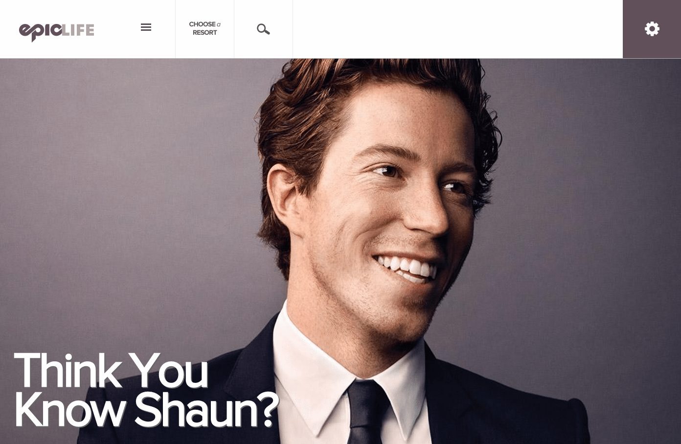
Yelp offers a good example of a small but amusing detail. Surprise can also be a bigger part of a design, as in The Epic Life Magazine Valtech built for Vail Resorts. The layout includes elements of surprise; text is set in a skinny centered column to increase readability; large format images break out of that grid in a surprising way, covering the entire horizontal space of the browser. We added a zoom feature on mouse-over that brings a slight but powerful moment of surprise to the user. Slideshows are handled in an innovative way as well. Rolling over them fires an animation that shifts the first image slightly right to left, showing the user that there is more content hiding there, and they can easily access it with a click to the right.
Adding to the layout choices we made, we engineered a personalization engine for the site. As users find articles they are interested in, a tagging engine remembers what they are viewing. Each time the user comes back to the home page, articles similar to their interests bubble to the top. The site basically recreates itself for every single person that visits. In lieu of surprising a user, this magic happens in the background and isn’t overtly noticeable. What we found, however, was an exponentially increasing number of engagements with the site on each subsequent visit.

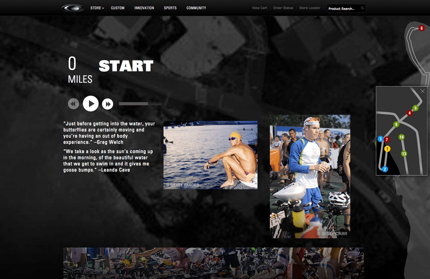
Interactivity is also key to delighting users. Oakley’s Conquering Kona microsite campaign included an interactive map that led users through an audio and photographic essay of Ironman champion athletes telling stories of gruelling Ironman events. We added delight by granting the user power to interact with the site in whatever way they chose: They could take a linear path through the route of the Ironman, from the starting line to the finish line, or they could skip to parts of the race that most interest them. Interacting with the map, audio and photos created an immersive digital experience that delivers a true feeling of what it’s like to be an Ironman.

Ultimately, digital creatives work hard to create beautiful layouts that meet usability standards, are easy to navigate and give users the information they desire. What we’ve found at Valtech is a deeper desire to be delighted. When measuring project metrics, one of the most important checkboxes should be ‘user smiled’.


