
Responsive design has taken the online world by storm. The variety of devices and configurations with which a user can access your website are growing exponentially and you need to address them all if you want to have a consistent digital presence.
If that first paragraph struck fear in your heart at the idea of completely overhauling your beautiful, well constructed company website, take a breath. We're here to tell you that an overhaul is far from necessary.
Just as new batteries can make a remote control fully functional again, a good review of your current site’s code can allow it to respond to all your visitor’s needs. This article will outline the six steps we've found to be crucial during several projects retrofitting websites for responsive designs. Before starting the code work, you need to evaluate your current site. You'll first need to answer these 4 questions:
- Is the site grid based or is the layout structured in a way that the column widths can be manipulated by editing only the CSS?
- Do the HTML elements follow the same order as you will want the content to appear in mobile view once the retro fit is finished?
- Does the navigation have too many top level sections and/or a deep multi-level structure?
- Are there any components that use Javascript? Are there any DOM manipulations that can damage the layout responsiveness?
With the answers to those questions, you can start working on the code changes to make the magic of responsive design happen. You'll need to check both the HTML and the CSS of the site fairly often during this process, so be sure to becomes familiar with your browser developer tools. We recommend giving it a go before getting started: hit F12 and find what makes your site tick.
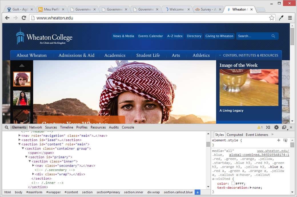
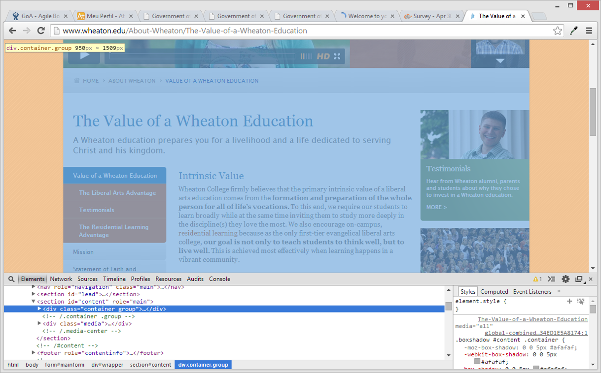
Note: All examples for this blog post have been pulled from a responsive engagement of a Sitecore website for Wheaton College.
All good to go? Let's get to work.
Step 1: Add meta tag
We need to make sure that the site’s viewport will respond to the different resolutions of the devices, allowing the CSS Media Queries to work. This is achieved by adding the following meta tag to the <head> of all pages:
<meta name="viewport" content="width=device-width, initial-scale=1.0">
Step 2: Manage different classes
Now that the layout can respond to different resolutions, we need to make it do so. For that, we scan the UI to find how the layout’s width is applied and which elements and classes are responsible to manage it.
In some websites, you may see several containers across different sections and templates, all with different classes- the width applied to each. When all classes are recognized, we'll remove the width styles of each, add a <div> width class container wrapping the content of each section (header, content, footer, etc) and apply a max-width style to that class. In doing that, we keep the same overall width of the layout but enable it to adapt itself to smaller window sizes.
Step 3: Adjust your layout accordingly
Wondering why your content isn't resizing when you resize the window, even though you completed Step 2 perfectly? It's likely because you have a multi-column layout and your columns are all styled in pixels.
This can be an issue if your developer failed to use a generic grid system. To remedy that, start by gathering all classes related to layout columns in one place and group them by type: left column, right column, main column 100%, main column with one side column and main column with both side columns. Once you do this, it will be easy to change the pixel widths to percentage ones, making the layout fluid.
Step 4: Create media queries
The last step to make the structure of the site fully responsive is to create the Media Queries that will adapt the content to the viewport. The approach we take at Nonlinear regarding resolution breakpoints is to first define the desired UX/IA on key resolutions, according to most used devices, and then analyze the behavior of the content on all different resolutions in-between the key ones to see how it needs to be tweaked to keep the best presentation/interaction.
Before

General Media Queries breakpoints:
- 912px: maximum width of the content
- 767px: mid-size/tablets
- 480px: small/mobile devices
- 400px: smallest viewports
In terms of layout, the styles added to the Media Queries add margins to the content when the viewport reaches the width of the content and make the layout columns stack in a small resolution.
After

Step 5: Perfect the navigation
Now we've come to the biggest challenge in retrofitting a site for responsive design: the navigation. The goal is to guarantee that all pages can be reached easily in every resolution and on every device. This is no simple task, considering that every site has its own information architecture and different navigation structure to contend with.
Let's look at an example: the Wheaton College website has 8 top level navigation items. All of this items have sub-items and the sub-items some times have children of their own. On the high-resolution version of the website, the navigation levels were split between the top menu, footer and left column, with the first and second level appearing in the top menu and footer and the third and subsequent in the left column, when you accessed a page inside each section.
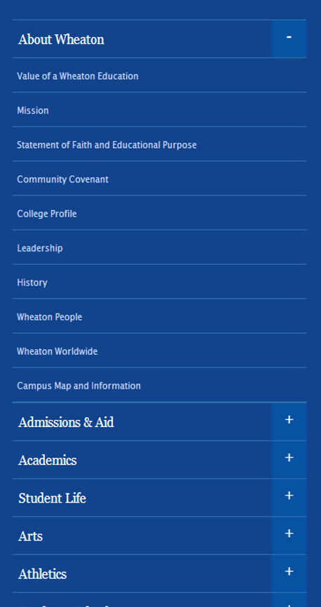
The solution for small resolutions was to hide the top menu and turn the footer menu into an accordion. A button was added to the header of the site that scrolls the page to the footer to show the navigation. On the other hand, the left column was turned into a drop down menu placed on top of each page content and pushes it down when it’s open.

When dealing with retrofitting, you will find some points where you have to make a choice between user experience (UX) and code integrity/web standards. For us, UX tends to have some advantage because no matter how beautiful your code, unless your user is going to benefit, it shouldn't be your focus.
Step 6: Time to tweak
It's finally time to dive into the details and make sure that every piece of the puzzle works perfectly in every viewport and device. To achieve this, you should go over every component and adapt their sizes, content display and allow different types of interactivity.
Tweaking the font size and line height of paragraph texts to increase readability in small screens and increasing the size of buttons for devices that allow for a touch interface are your first big concerns when making the jump to responsive.
Besides having to deal with different forms of interaction across different viewports, you may come across a fairly time-consuming issue in that some components will have had their style or markup manipulated via Javascript. Although it's recommended not to use Javascript to handle presentation, some effects cannot be achieved exclusively with CSS, especially in websites that have to support a wide variety of browsers and devices.
To deal with a situation like this, where a plugin was being used to manipulate the position of block elements, we used CSS to overwrite the styles applied by the plugin when the resolution was bellow 480px. Since the layout changed on these cases, the manipulation of the position did not need to exist anymore.
After all these steps, all that's left is fine-tuning the styles. Now is the time to go over each and every page of the website, using every device available and test all of the potential ways a user can access your site. We recommend using an actual device whenever possible, because this the only way to safely replicate how your user will view and interact with the interface.
We hope this has inspired you to take a dive into the responsive pool.