


The site style sheet will cause an image to scale based on the space available. This is done to support different screen sizes and allow the same content to be repurposed in multiple locations without needing to actually change the image.
What the uploaders of images need to be aware of is they are attempting to get multiple images to line up inside a responsive grid, those images all need to follow the same aspect ratio. A simple example of the type of layout can be seen in the following screen shot. The design of this page requires the images to align top and bottom when in a wide screen.
Figure 1 – Wide screen example

As the width of the screen collapses, the importance of alignment of the images shifts to sides of the images. See Figure 2.
Figure 2 – Narrow screen example

In most responsive design situations, the desired alignment can be accomplished when the images have the same aspect ratio – the proportional relationship between its width and height. For example, the following boxes, while different in size, have the same aspect ratio.
Figure 3 – Aspect ratio

As the images scale evenly across both dimensions to fit the available horizontal space or width or the area, issues will arise if the user attempts to use different aspect ratios. If both of the above images were placed in the gray box (figure 4), the resulting visual layout (figure 5) would be the same and the images will occupy the same space.
Figure 4 – Available space

Figure 5 – Images with same aspect ratio placed in gray box
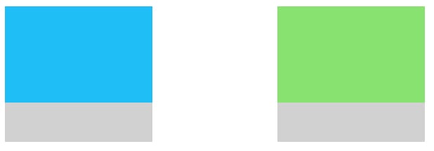
If however, our green image had a different aspect ratio, the image will stretch to fill a different space. In this example, the green image is much taller than it is wide, a different aspect ratio than our blue image.
Figure 6 – Images with different aspect ratios

When the green image scales in width to fill the space available, the same scaling will be applied to the height.
Figure 7 – Images with different aspect ratio placed in gray box

To learn more about how Sitecore can help you manage images in your responsive design, read on.
Sitecore’s ability to manipulate images
As you can see in the earlier content, the responsive template has some ability to control images, however depending on how much you are attempting to reuse components, it may be necessary for the content author to use some of Sitecore’s image manipulation tools.
First, let’s consider the “Modify image appearance” feature that is available on any image in Experience Editor. To access these settings, just click on the image and then the “Modify image appearance” button.
Figure 8 – Image Appearance Button
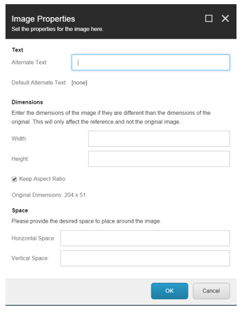
When the image properties dialog opens you will have access to:
- Alternative text. This is text that shows when you hover over an image. This is critical information to ensure both usability and accessibility.
- Dimensions. The current dimensions are shown and you can specify new ones. There is the option to lock or break the aspect ratio.
- Space. The dialog allows you to introduce space around the image, but we do not recommend this. This is a legacy of old web design approaches and is generally incompatible with responsive designs. For the coders out there this sets the hspace and vspace attributes.
Tip: changing image properties does not modify the actual image. This allows the same image to be used in multiple locations, but its appearance altered as required.
Figure 9 – Image Properties
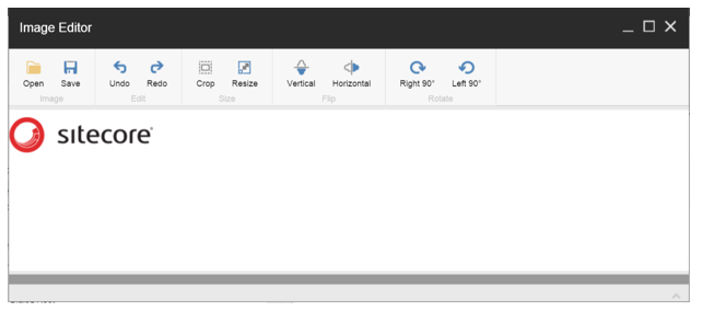
You can access the Sitecore Image Editor from the Media Library or Content Editor. From this tool you can crop, resize, rotate and flip an image. Tip: keep in mind that unlike image properties any edit you make to the image using this tool changes the image itself.
Figure 10 – Image Editor
More on the marketplace
There are numerous add-ons available in the Sitecore marketplace that may also be worth your consideration.
- If you want to automatically optimize images for the web try Image Optimizer:
- Manual optimization from the media library:
- Robust editing via integration with Pixlr:
- Dynamic cropping, sizing and general manipulation of images:
- Pipelines for gray scale, cropping, rotateflip: https://marketplace.sitecore.net/en/Modules/I/ImageProcessor_Module.aspx
- Custom field with cropping: https://marketplace.sitecore.net/en/Modules/I/ImageCropping.aspx


